By James Kwon
It’s probably about time to reset and relaunch your sales and marketing strategies.
Check out our sales playbook!

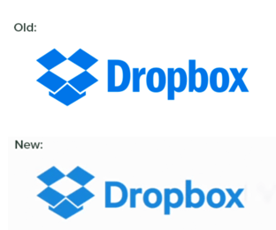
The new logo keeps the same flat glyph (the box icon) but changes the logotype. The new Dropbox logotype is set in a much more squat san serif, resembling Motiva Sans, but personalized slightly for their brand. These personalizations are similar to the subtle shifts made to the previous typeface Franklin Gothic.
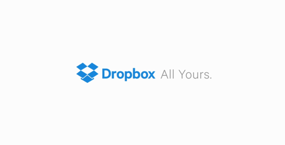
The clever tagline, “All Yours,” tells the real story of Dropbox’s benefit to the world – allowing you to keep all your things in one place and yet share them with your collaborators. Perhaps that’s why the company chose a slightly more expanded logotype to pair their mark. A stretch, I know – you see what I did there?
The only awkward part of the new logo is the contrast in size with the tagline itself. At the end of the beautiful commercial, the tagline hangs too tall to match the cap-height of the logo’s x-height, and too small to be equal.

The new Dropbox logo can be seen at the end of their “Dropbox: creative freedom” video posted on Youtube on October 13, 2015. The video is 60 seconds long.
Dropbox’s branding guidelines page also has yet to have any update, and is missing other critical steps on the rebranding checklist. The logo would be the fourth redesign of the Dropbox logo. The original logo was designed in 2007 by co-founder and CEO Drew Houston. The logo was redesigned in 2008, 2012, and 2013. The last time they updated their logo they posted about a short history of the logo on their company blog.
If you have the inside scoop or thoughts on the new logo drop them in the comments below!
Shout out to our designer Jesse Hoyos for noticing this and mentioning it at native creative (an internal design share meeting) yesterday!
United Healthcare is the world’s largest provider of healthcare services in the nation. A sub-division of UHC, Optum Health, manages...
Uncategorized
How do we take a topic we know so much about and boil it down to a few minutes of...
Digital Marketing
Check out our Vimeo channel just for start ups You probably already know that video is an extremely viral marketing...
Business Resources