By James Kwon
One of the nation’s largest communications companies, and most recognizable brands finally introduces the iPhone into their offering – They want to tap into market segments where they can have a key distinguishing advantage. They found that people would buy more phones if they gave them an app they had to use daily. In conjunction with Medulan, The Verizon Health Monitor Project was born. Now we have to make an incredibly intuitive UI/UX that introduces unsavvy users with cutting-edge mobile technology.
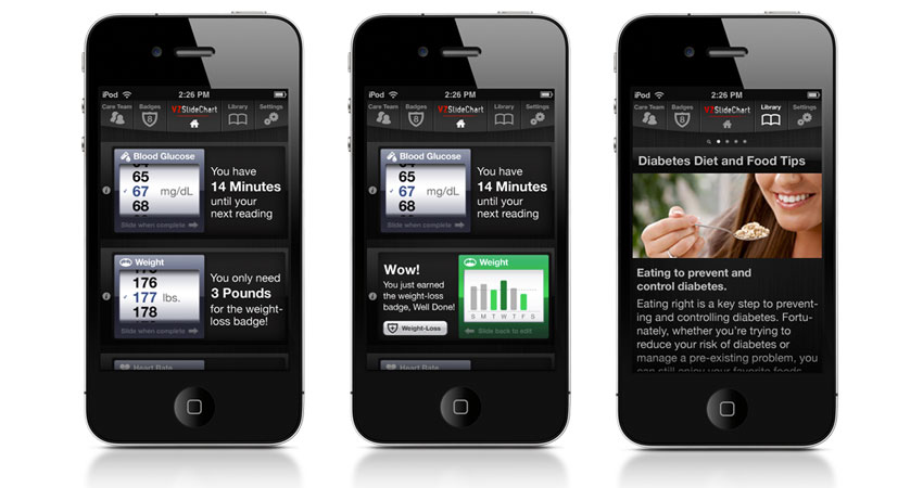
An intuitive user interface and user experience that would excite users to engage multiple times a day. Before we architected and designed the VZSlideChart, users had to input information about their blood glucose, weight and other diabetes information several times a day. We found that the two most innovative, and easy-to-use interface systems from the newly minted iPhone were the swipe-to-unlck, and scroll features. We combined these simple gestures to eliminate that need for traditional data entry on a mobile device and wrapped it in a UI that begged to be used.
Through a dialpad system of data entry, daily information took one minute and forty seconds. It doesn’t seem like a lot of time, but when you add it up by multiple times a day, and tens of thousands of users across the country, the time added up very quickly.
With a simple gesture-based approach, we were able to cut this time down to 43 seconds. Saving thousands of hours over the course of the year for patience with this disease. This slick and accessible app is still a key example of proper UI/UX working together for the strategic goal of better interactive applications.
I’ve been in sales for years, and have faced what feels like all the challenges that sales can come up...
Business Resources
GTECH's new website affirms their status as industry leaders.
Uncategorized
Providence's new web presence provides effortless, “user-friendly” service with fresh internal and external department access
Website Design