The user experience, commonly referred to as UX, is how you develop your content and company’s touch points to make user interactions easier. However, UX should not be confused with user interface (UI). UI is responsible for the visual design and aesthetics of a piece of content, such as a website, logo, or call to action button. UX can be responsible for refining aspects like page response times, customer service, product value, and anything else that will affect the quality of a user’s interaction.
When thinking about UX, you must consider their hierarchy of needs and how you might adapt your brand’s presence to meet those needs. UX should be prioritized in this order: functionality, content, aesthetic of interface, and usability. If UX is not prioritized within your interface, you will soon see lower conversion rates and sales, higher bounce rates, and decreased consumer engagement.
To ensure the best possible UX for your business, you should avoid the following mistakes:
Not Establishing a Visual Hierarchy Visual hierarchy determines the order in which users read information. An effective visual hierarchy will guide a user’s eye towards valuable content or calls to action. If a visual hierarchy is not established, the user interface will feel unorganized, and your core objectives may not be met.
No Typographical Hierarchy As is with a visual hierarchy, a typographical hierarchy denotes the most important information from the rest. If an interface has nothing but bold, large characters, the user will not know what information is considered important. This decreases the user’s ability to quickly scan or locate relevant information, which will frustrate the user, and leave them with a negative overall user experience.
No Research A great user experience is meaningless without user research. Without knowing your audience, their needs, their feelings, their pain points, you’ll always be guessing how to deliver content in a way that is meaningful to them.
No (or Little) Attention to Mobile As of July 2019, over 52% of all internet traffic happens on a mobile device. Yet, mobile design is still almost always an afterthought. Do not make the mistake of overlooking the user experience for mobile users. Take Starbucks as an example, their focus on a user friendly design makes it one of the top most used loyalty reward apps. Known for its engaging consumer content and convenience it’s no wonder the company has 23.4 million users on the app.
No User Testing User testing validates your user research. Your interface should always be tested in the hands of real users before going live. The sooner you get insight from your target users, the sooner you can iterate and identify issues, strengths and opportunities. Platforms like Hotjar and Crazy Egg are great ways to track how users use your site.
Overcomplicating If you have overcomplicated your interface, a user is going to have a hard time knowing where to look first, or worse, they will get frustrated and leave. Overcomplicating an interface can take several forms, but most commonly points to too much variation, animations, and design flourishes. To combat this, you should include an appropriate amount of white space.
Not Acknowledging User Actions Actions need to have a recognizable acknowledgement. Not highlighting which page a user is currently on via interactive tab design or a clear header can cause your users to feel lost. Not displaying a success alert when a message has been sent through a contact form will cause users to believe they have made a mistake. Do not expect your user to be able to assess for themselves your website’s organization.
Keyword Stuffing to Attract Visitors Keyword stuffing, filling your content with high ranking search terms to increase your SEO rank, may temporarily push your website towards the top but will fail to benefit you in the long run. In fact, Google’s algorithms are smarter than that. If your keywords grab visitors but can’t keep them, you’ll fail to see any increase at all. Good UX can help retain users, decrease your bounce rate, and will result in visitors sharing your content. These actions detected by Google’s algorithm are defined as markers of “searcher satisfaction” which will help your website obtain a more effective SEO ranking compared to a strategy that relies on an overuse of irrelevant keywords.
Aesthetics Over Performance Design is extremely important when laying out the architecture for your UI, but aesthetics should never be prioritized over usability. If a user is having a hard time finding the call to action in the middle of multiple graphic elements, they are likely not going to convert for your business.
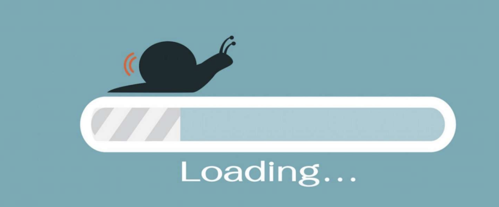
Loading and Response Times A user clicks to load the homepage of your website. Ten seconds pass by. Will they still be onyour site waiting for the page to load? No way! In fact, after only 3 seconds up to 40% of users will abandon your site. One of the worst mistakes you can make for UX is overdesigning your product, causing your load and response times to decrease due to the sheer amount of code.
Not Prioritizing Content You’ve heard it before: content is king. The truth is, no matter how elegant of a design you produce, or how tailored the functionality is, no one will spend their time on an app or website that is of no relevance to them. UX and content go hand in hand and if you try to prioritize one over the other, your overall user experience will always come up short.
If you do not prioritize UX, you must consider this: How much business you can afford to lose? While hiring a UX specialist may be a costly decision, it can improve your conversion and lead generation metrics in the future, which in turn will increase your overall revenue. UX should be an investment, not just an optional marketing technique.
Join us for our live webinar and get real time analysis of your UI/UX!