By James Kwon
09/28/2017
By James Kwon
Upgrade the website from a sprawling library of information to an admissions-driving machine.
Redesign the website around a buyer’s journey that hones in on a singular admissions audience persona.
Moses Brown is impressive to say the very least. Boasting an expansive 33-acre campus in the heart of urban Providence, Moses Brown is home to 230 years of excellence in academics, arts, and athletics.
The scholastic powerhouse takes tremendous pride in inspiring and instilling enduring character and confidence into the hearts and minds of their student body. High-achievement permeates every facet of their institution, from the 50-plus clubs to the two dozen offered AP courses all the way to their fleet of 58 athletic teams. Moses Brown is a school to behold.

However, although Moses Brown is nothing less than an exemplary academic institution, they did have one chink in their blue-clad armor: their website.
To be clear, their old website served many purposes effectively. It answered questions and gave a well-rounded snapshot of the school. With that said, the old site fell short when it came to accomplishing their primary purpose. While the site acted as a repository for a monstrous amount of information pertaining to student life, school events, curriculums, and school history, it failed to tell the Moses Brown story in a style that drove new admissions.

As a general rule, the more pages comprising a website, the more difficult it becomes for visitors to identify clear paths to action. Moses Brown found itself at a virtual crossroads: either stick with their information-dense website or redesign the site to focus on driving admissions.
If you’ve read up to this point, I’m sure you have a hunch which direction they chose.
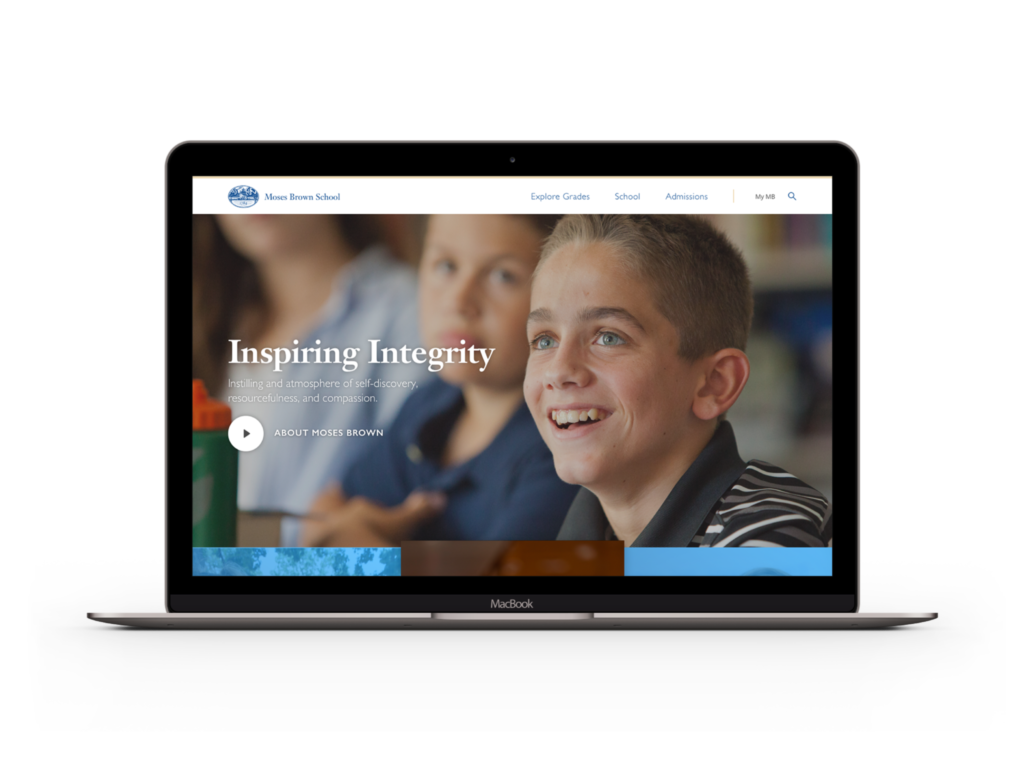
Websites that are designed around a singular CTA (call to action) rely on their homepage to set the strategic scene. Moses Brown asked us to help them re-focus the site on three homepage imperatives to switch the mindsets of visitors from browsing to inquiring.
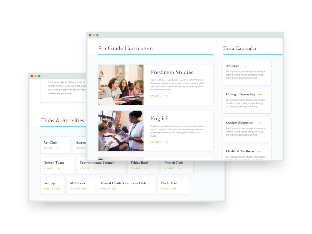
First, we placed windows to Moses Brown’s three levels of schooling (lower, middle, and upper) directly below the hero’s fold. Hovering over a window triggers grade buttons to appear, inviting the visitors to explore a grade page that clearly lays out the curriculum using ‘class cards’, which are essentially modules that navigate to individual class pages.

We decided that elevating the curriculums to the site’s center stage was crucial to initiating the admissions thought process. Grade curriculums are the backbone of any solid education which is why we made it exceedingly easy for parents to access them. The header menu also features an ‘explore grades’ item, beautifully laying out a grade selection menu for visitors to peruse.
Next up, we placed a ‘schedule a tour’ CTA smack in the middle of the homepage. Given Moses Brown’s sparkling reputation and their breathtaking campus, we understood that many visitors would be eager to skip the online exploration of the school and use the website as a means of scheduling an in-person visit.
Regardless of how beautiful and optimized a website we created, we knew we couldn’t compete with the pristine school grounds. Therefore, the sooner the website sent interested leads to the campus, the quicker they’d move down the sales funnel.
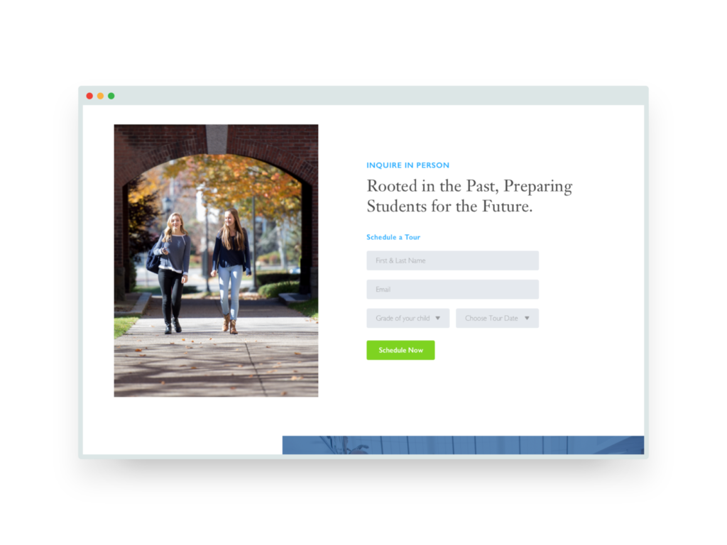
As opposed to the school’s old site, we prioritized the CTA’s placement directly after the school curriculums. The idea here was to prevent visitors from venturing deeper into the site’s architecture without considering immediate action.
The final imperative on the homepage was to evoke a sense of Moses Brown’s heartening culture and bustling campus community. We achieved this by placing an upcoming events section above the school’s teeming blog. A second CTA follows with a strong community appeal once visitors get a sense for the school’s full spectrum of activities and opportunities.
Ultimately, the team at Moses Brown had to depart with a significant portion of their original content in order to focus on funneling more admissions through their site.
Overflowing content can be a chronic barrier to accomplishing your web-driven goals. Moses Brown recognized the need for change and committed to consolidating their content for the sake of crisp navigation, clear communications, and immediate action.
Although a sleepy city on the surface, Fall River was a bustling hub of the east coast textile industry throughout...
Branding
Google may soon be changing their image ranking algorithm.
Digital Marketing
How to successfully go through TSA lines with video equipment.
Agency Best Practices