By James Kwon
It’s probably about time to reset and relaunch your sales and marketing strategies.
Check out our sales playbook!
02/17/2017
By James Kwon
Fall River’s bad rap earned it a spot on a ‘50 Worst Cities to Live’ list from a popular media outlet, marring its reputation and changing the prevailing perception of the city.
In an effort to sway it back into favorable territories, we set out to discover Fall River’s essential character. We then built a brand based on those findings, and supplanted the unfavorable story with a message of inspiration, hope, and abundance that more accurately depicts the city.
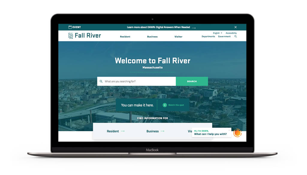
After the Fall River rebrand was launched to an eager crowd of 300, it began to gain traction, aligning businesses and residents around the new, empowering message. The story that follows will give you a backstage pass to our branding process, showing you how we made “Make it Here”, here.
As you cross the big, blue Braga Bridge headed eastbound on I-195, Fall River’s skyline comes into sharp relief, boasting countless steeples and smokestacks that have been reaching for the skies for centuries.
Although a sleepy city on the surface, Fall River was a bustling hub of the east coast textile industry throughout the 1800’s. At one point in its history, the city’s spindle count surpassed its population, earning it the nickname “Spindle City.”
But, as manufacturing moved offshore throughout the late 20th century, Fall River fell into an identity crisis (alongside of many other post-industrial cities across the country). With its days as a textile mecca fading into the past, Fall River began searching for a new story to tell. That marked the starting line for this rebrand. We had to recover and restore Fall River’s promise to its rightful place in the hearts and minds of people across the Northeast.
Delivering a new story to Fall River sounded simple as a soundbite, but our branding team had limited exposure to Fall River. We quickly realized we’d have to thread ourselves into the city’s modern day fabric to find its elusive brand in a bottle.

We needed to think like insiders if this brand was going to resonate with the people. Fortunately, Mayor Jasiel Correia handpicked a branding committee that featured a broad stroke of inside perspectives. Their job was to keep us honest and on track throughout the duration of the project. Our job was to craft a brand that inspired residents to align with a positive perspective, leaving the stained one behind in the hamper.
 The branding process began with hundreds of interviews with business owners, residents, community leaders, and other prominent Fall River figures. As the interviews with the locals went on, trends started to emerge. Generally speaking, residents jumped at the opportunity to tell us all about the city’s shortcomings. However, after a few minutes of mud slinging, something surprising would happen in nearly every interview: the interviewees would switch their scripts from bashing Fall River to singing its praises. They’d rhapsodize about its rich history, the resiliency of the city’s Portuguese culture, and the pride that still resided deep within the psyches of every resident.
The story residents longed to tell gradually shifted into focus as the project matured. They wanted to believe in their own personal potential within the greater context of the city’s potential. They didn’t want to escape. Instead, they yearned to make it work, whatever it meant to them. The winning idea took shape from these insights, the idea of making it in Fall River, or, from the perspective of the residents, Making It Here.
That interchangeable it is the crucial component that gives the brand its strength. Simple, palatable, and punch-packing. It means something uniquely personal for each and every resident of the city. Make a family here. Make your life here. Make an innovative new product here. Make your art here. The applications are endless.
After a handful of iteration between our branding team and the mayor’s branding committee, the final brand story surfaced.
The following brand story formed the basis of brand’s look and feel. Our designers interpreted and translated this story, along with other copy assets, to find the proper look and feel that would give the message wings.
“Make It Here” is as much of an invitation as it is a proclamation. The idea pulls forward insights from periods of abundant immigration, prolific manufacturing, and rampant hope, helping us see Fall River’s potential and our place in it. It rouses and instills ambition, aspiration, and achievement. It’s a rallying cry for the dream-chasers, a mantra for the hard-workers, an invitation for all to find their way in Fall River. Because they can make it here, whether it’s a device, a dream, a destination, or the chance at a fresh start at a new day.
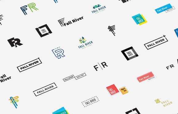
 After all of the foundational branding work is solidified and approved (the brand pillars, brand story, etc), we began the design process. We conducted sketch sessions where the our creative lead explained the parameters of the project and keeps everyone on track as they began to interpret the approved directions.
Once a pool of logos are generated, we began to build them out into brand systems, which retain the style and tone of the original mark but address the all of possible dynamic applications. We practically chant the maxim ‘Systems, Not Stamps’ as we take logo directions to their logical systematized ends.
In Fall River’s case, the brand system is tightly packed with winks and nods to the city’s unique personality and history. For instance, the logo’s first three stitches that flow into the unbroken thread symbolize the city’s historical timeline. Fall River is known for its textile manufacturing prowess, which meant the new brand couldn’t bury that aspect of the city. Instead, we honored it.

But the stitches contain another, deeper message. They represent a work in progress, a work that’s made steady progress but still has a ways to go. Once people are not only told, but shown, that they have a proper place in the progression of their city, they’ll see themselves in the brand. They’ll see their own stories weave into the larger story of Fall River.

When it was all said and done, we felt honored to be wading in the waters of Fall River’s rising tide. The history, the culture, the people. Everything about the city has charm and depth, it feels real and raw there. We look forward to seeing Fall River take its next small steps and giant leaps as it rises back to its place of prominence in New England.
Building a business is one of the most difficult, and yet rewarding challenges an entrepreneur can undertake. In business, there...
Branding
One of our latest projects was “Axis AV,” but that wasn’t always its name.
Branding
Listed above are just a handful of the companies located here that are killing it in the video production industry.
Video