By James Kwon
06/27/2017
By James Kwon
When we first started working with Community Teamwork, we saw a lot of opportunities for their brand. They have such an inspiring story with an incredibly rich organizational memory, so it was important to us to preserve a connection and transition from the old branding to the new. We were faced with the challenge of updating the brand with added personality and legibility while maintaining the context of their history.
Community Teamwork is a professional organization with a huge amount of compassion for the communities it serves. It drives change with vital services and key collaborations, to create housing, education and economic opportunities that reduce poverty and strengthen communities.
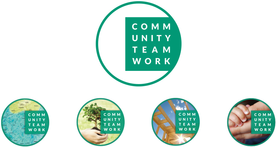
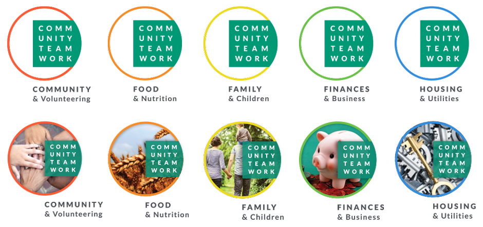
Figmints came into this excited by the challenges at hand and re-worked their brand. We picked an inclusive shape, and worked it into a window through which you can see the impact of Community Teamwork through a rotating set of photos of Community Teamwork at work. Each of the five program divisions has its own variation on the main branding as well, which creates both unique identities for each program and a cohesive unit for the organization as a whole.
We had a blast with the proof of concept phase — presenting a bunch of print designs, as well as some fun apparel concepts, like t-shirts where the center of the logo is open to be filled in by the wearer. Finally, we created and delivered a standards manual they could use to roll out the brand in a consistent way throughout the organization.
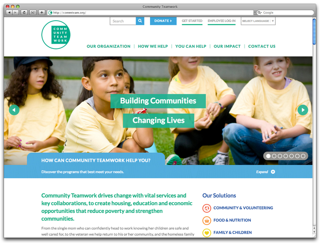
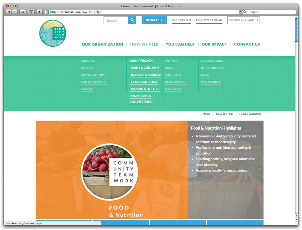
Community Teamwork’s original website was the oldest site we’ve ever re-designed: it was really fun to bring it up to current standards and re-build it to fit the needs of all of their users. This was an especially challenging re-design because we balanced multiple goals, such as connecting people to needed services, getting donors, volunteers and partners involved, and allowing people to access the site in a wide variety of manners.
The biggest focus was making information accessible. Through a lot of filtering and restructuring options, as well as a keyword search and a widget that filtered programs based on needs, we optimized the information flow so that users from all audiences would be able to access the information that was necessary and relevant to them.
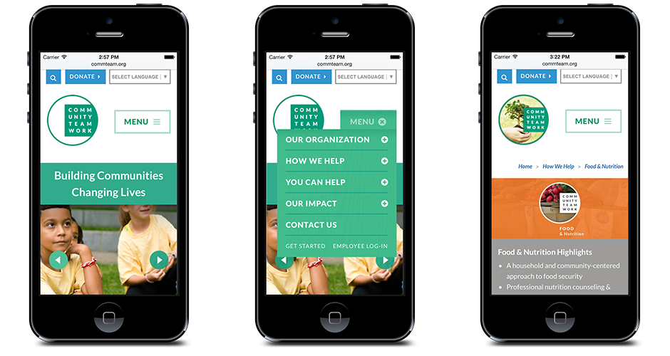
Another important part of the website was the application form, which is very intricate and captures a huge amount of information. By implementing a system of drawers, we were able to break the form down into manageable bites that kept users flowing through the form without overwhelming them.
Finally, we worked hard to prioritize accessibility. Not only is the site fully responsive for mobile users, it also allows users to translate the page into thirty different languages so that anyone can access the information they need.
We had a blast creating a video outlining both Community Teamwork as an organization and the rebranding. This video was also played at the annual meeting as part of the brand reveal, and covered not only the new branding and website, but also each of the major subsidiary categories.
In a wild day of shooting all over the city of Lowell, we used a photojournalistic approach to capture the stories of a diverse group of real people that have been involved with Community Teamwork. Within a tight editing timeframe, we created a beautiful and professional end product that was not only played at the annual meeting, but will also be featured on their website.
For more information on our process can be found on our video page.
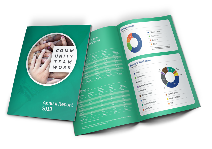
Because they are such a large and encompassing organization, it was very important for Community Teamwork to roll out the new brand in a planned and cohesive manner. In working with them, we figured that the best way to unveil the new brand would be a series of print materials: table tents and posters to show the new face of the company, an annual report to get into the new brand story, and business cards for outward representation of the brand.
The annual report was by far the most in-depth design. Not only did we need to present the new brand, we also wanted to strike the balance between displaying the global impact and diving into the personal stories of community teamwork’s clients. We accomplished this by designing a case study and an impact graphic for each subsidiary. Additionally, we designed infographics to make the revenue and expenses easily accessible.
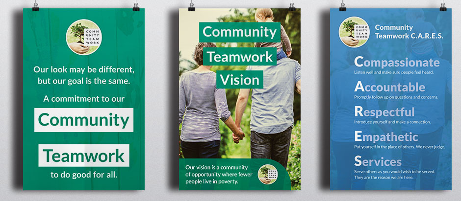
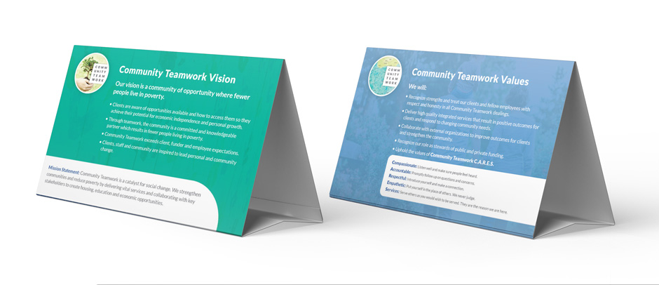
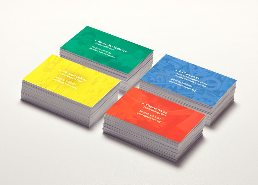
The business cards are color coded to the subsidiaries, just like the website and the rest of the branding. It was very exciting to bring this color coding aspect of the brand into the real world. Finally, we created posters and table tents to highlight the new branding story and bring everyone in the organization onboard.
Stay up to date on the most recent design trends by checking out our 29 favorite UI/UX design blogs.
Website Design
Streamlining your process and being more productive is possible! Here are 7 tools to prove it.
Digital Marketing
When we first started working with Community Teamwork, we saw a lot of opportunities for their brand.
Uncategorized