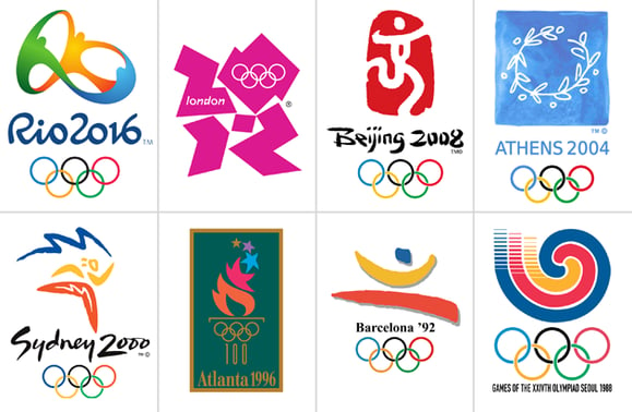
Earth’s most grandiose sporting event can teach us a thing or two about brand consistency in a messy, convoluted, and downright chaotic world.
Built on the ideals of transcendence, togetherness, the limitless capacities of human achievement, and the feats of athleticism that stun and inspire, the Olympic Games finds a way to completely shape-shift its brand every four years while miraculously staying true to its core.
At first glance, the Olympics is a branding paradox, rife with lessons for all lesser known brands to study and glean. Let’s unpack how the globetrotting Olympic brand
achieves consistency amidst its radical shifts.
Every four years, the brand of the mighty Olympiad morphs and molds to fit the history, politics, and prevailing zeitgeist of its host country.
The International Olympic Committee (IOC) tasks the host country with the design and implementation of their own proprietary trademark, including television broadcasting, sport-specific logos, posters, fonts, and stadium signage, to be rolled out as the opening ceremony marches closer.
This creative autonomy gives native designers a chance to honor their homeland and showcase their country’s distinctive creative prowess to the rest of the world.
However, handing over the branding reins every four years can make it difficult to keep the original Olympic brand consistent and intact.
Olympics Over Time
The Olympic logos, and overarching look and feel, have varied widely since the games were reinstated back in 1913 after a 1,500 year moratorium.
This variance inspired me to delve a little deeper to try and discover if and how the Olympic brand at large retains its consistency and impact over time.
The common denominator that anchors them all in some semblance of consistency is none other than the iconic Olympic rings. Regardless of what happens to the logo every four years, the rings remain interlocked and omnipresent in the Olympic brand. But are the points of tension between each ring really the only thing tying the brand together?
Well, not exactly.
Remember the core values we covered before? Those are where the consistency of the brand emanates from… the intangible elements that speak to that innate place inside each one of us that pushes us to aspire, connect, and achieve.
Wherever you reside on this spinning ball of rock and water, those values align with who you are and who you want to become. They’re in our DNA.
Therefore, the Olympics’ extrinsic brand of diversity and flux (both geographically and aesthetically) is intrinsically consistent and steadfast regardless of where it ends up every four years.
Unified Differences
Of all the lessons the Olympics can teach us about creating an ironclad brand, this may be the most poignant of all:
If the core values of your brand have truly sunken into the hearts and minds of your collective audience, those values will guide your audience through shifting aesthetics.
To state it more simply: If the essence of your brand is widely understood, you’ll have more wiggle room to change other brand elements.
The Olympics are about celebrating our humanity, our connectedness, and the diversity of the world. These core messages have been pile-driven into us for the better part of the last century.
In a sense, the dramatic quadrennial makeover speaks to the Olympic’s brand consistency more than, say, using the five interlocking rings over and over again. Because as the Olympics traverses the globe, it reaffirms its core values and thus,
attains its consistency regardless of changes to the exterior aesthetic.
That’s my take. What’s yours? We’d love to hear your opinion!
